Analysis Tips
On this page, we will explore the most important information you should look at on the report. These tips will help you quickly analyze your test report and make the most out of it.
Note that we try to cover the most common use cases but may have missed some of them. Feel free to report any other use case to us through the chat or contact@octoperf.com.
Response times
Obviously response times are going to be our first stop. Here a quick overview of how response times are measured:
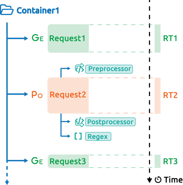
In this situation the container response time is the sum of its children (RT1+RT2+RT3), note that it can differ, if for instance you used the parallel plugin.
Also response times of each individual request does not include the think times and other pre/postprocessors computing times.
Basic response time graph
The most common one is the Hits and response time graph:

It shows the average response time across all containers (pages or transactions) for the whole test. The one above is from a test that was successful, we can tell since the response time remained steady during the entire test.
Still, there may be additional things to check since a steady response time does not means it was acceptable. This is what we're going to explore here.
Global average response time
The global response time is a very good way to spot obvious issues.
Whenever the curve looks like this, you know something is wrong:

Here we clearly see that after 16:21 the response times increases. It may not have reached a critical point yet but you've reached an inflection point and it is not likely to get any better later on. Investigate for any event around that time, in particular on your server monitoring.
Request or containers response times
OctoPerf shows the average containers response time by default but you can change that by editing the graph. Be careful since average container response times include the response times of scripts and also technical elements like if and while. Because of that this time may be very high, for instance when you have a while that runs for a very long time.
Instead it could be more relevant to look at average request response time. I say "may" because the average value across many requests may be very low and could hide problems because of that. In the end it is critical to always look at transaction response times.
Step by step response times
Here my recommendation is to check the result table.
Look for transactions that stand out by sorting by highest average response time:

A good practice is to put these on a dedicated graph to see if they are always high or if there is another inflection point.
The top chart item does exactly this:

In this case we can clearly see when the slowest transaction hit a bottleneck, this info is invaluable for proper root cause analysis.
Tip
You can spot them even faster using our built-in SLAs.
Min and max response times
Don't forget that you can also look at min and max response times. Obviously that will give you insight on the best and worst transaction times. If you notice an important difference, you should go have a look at percentiles.
Hit rate
The hit rate is closely related to response times. The Hit rate means how many of this request or container am I running each second.
When you see only hits it usually refers to the total number of times a request or container was run during the test.
Inflexion point
Now it's easy to understand that when the response times get higher, you virtual users have to wait longer for a response and thus generate less hits overall.
This can take many forms but in general the global hit rate should follow the amount of users running. When it doesn't it means there was a problem with the application, usually an increase of response times. Sometimes the increase is small and barely noticeable but it's easier to notice on the hits rate.
On this example:

The green area represents the difference between hits and users running, ideally it should be barely visible. Here we can see after a while that the hits go down compared to the number of users. This clearly indicates that the application is getting slower. This means you must now analyze response times and find out if they were too high. Or user percentiles/maximum response times to check if a few outliers are causing this behavior. But in any case you've spotted an inflection point that you should investigate.
Synchronicity
When using no think time or fixed think times, your users might be synchronized on the same pages at the same time. This is more visible when one of the pages is larger than others or when it has a lot more resources (images, scripts, etc...).
If something goes temporarily wrong with the application it can intensify this phenomenon like this:

We clearly see that users are running the same hits intensive pages almost at the same time. It slowly goes back to normal but the load generated is very chaotic and it is hard to explain to stakeholders. It is usually better to re-run the test with a bit of randomness in your think times.
Error analysis
The error rate is often overlooked but it is also an important metric. There are mostly two types of situations:
- Peaks of errors
- Recurring errors
We'll see what we can deduce from each one of these and also how to go further.
Peak of errors
A peak of error would typically look like this:

We can see two peaks during this test. Notice how the hit rate matches the error rate.
This is usually because the server is overloaded and answers all requests quickly but with an error. In which case, all pending requests get an answer over a short period but that answer is an error message. If you do not look at the error rate you might think that the application is doing better when it's the opposite.
Recurring errors
Some other times you may see recurring errors like this:

See how a small amount of errors occurs every minute? There are two explanations possible here:
- Your test scripts do something invalid every minute. Try to run another test using random think times inside your test scripts. This way errors will not be synchronized anymore.
- The infrastructure or application have a batch or protection that activates on a regular basis. Check for firewalls and proxies, also automatic tasks triggered by a recurring event that may cause this.
To go further you can have a look at the error rate per container or transaction and see if one of them stands out.
Step by step errors
To see the error rate of a particular container, a good first step is to sort the result table by highest number of errors:

In this example we can see that some transactions fail all the time whereas others do not. It is already a good indication of what might be the issue. Try to confront that with server logs, check what the failing steps do in the application and you should have a good idea of what's the issue.
Overall errors
You should also check the error section of the report for the percentage of response codes per type.
If a 4XX or 5XX code represents more than a few percent of the total response codes it is worth investigating.
Another possibility is that you get "none" as an error code:

This means that the underlying JMeter engine raised a Java error instead of getting a response.
The most common situation is that there was a timeout or the remote server was not able to answer your request.
You can find out by opening the error details in the Error table below:

Tip
To find out more about each error type, check the error table documentation.
Error rate
Another important graph is error rate per error code:

In this example we can clearly see that most 504 errors occur during a very short period of time. This tells a very different story than just looking at errors across the entire test:

You could also have a behavior like this:

In this case we see multiple changes in the response codes over time, indicating several problematic behaviors.
Latency and connect time
Latency and connect time are also often overlooked.
They are subsets of the response time, that correspond to specific events:

Latency is the time until we receive the first byte and connect time is how long it took to initiate the HTTP connection.
Connect time increase
When the connect time increases like this:

It means that reaching the application is taking longer and longer. It usually points to a network issue, but keep in mind that connect time also includes SSL handshake and other technical operations.
So you need to consider if the majority of the time is spent waiting for a connection. If so it might be an SSL issue.
If instead it gets worse when you add load, it is probably a network issue. If so you should see connection reset errors or timeouts.
Latency increase
When the latency increases:

It means that you spend more and more time waiting for your servers to answer. So obviously the issue here is that your server is overloaded. You need to check your server monitoring to find out why. The good thing is that you can rule out any netwrok related issue for now.
Response time increase
When the response time is very high in the beginning of the test:
 Initially latency is also high, but as the test goes, the issue seems to be shifting toward the network. With network being overloaded, the server is no longer facing as much load as he was and the latency goes down.
Throughput
Throughput can also tell us a lot about the application under test.
In this example we can see that most of the bandwidth is composed of images:

In this situation, if you want to reduce the bandwidth used and also the download time, there are a few solutions available:
- Use an in-memory caching solution to deliver resources faster.
- Use a CDN to deliver resources from a source close to each user.
- Optimize the size of your images. There are many possibilities here and most of them allow for lossless compression that can reduce size significantly.
You may also have noticed that other resources like JS or CSS can take a lot of bandwidth. This could mean that you did not minify or compress these files. Minification is a good way to save a lot of space by removing all unnecessary characters. Add some compression on top of it and you can reduce by a factor of at least 10 the size of these files. Some systems have what is called a production mode that will take care of this once activated, make sure to do so.
While this is being done, you may want to consider running another test without clearing the cache on each iteration, that way the impact of these resources on the bandwidth will be lowered.
Standard deviation and percentiles
Average values are a good start but going further it is important to also rely on variance/deviation and percentiles.
Standard deviation
First, deviation shows us if response times are very different to each others.
What's interesting is not the value in itself, but the trend:

We clearly see that it is getting worse during a sizeable portion of the test after 11h51.
A quick look at the result table can also tell us if the deviation is high when average and percentile are very different:

In this case 90th percentile is close to 10x the average.
Response time distribution
And another interesting graph is Response Times distribution:

Again we can see a high disparity in response times. This indicates that the application behavior is very unstable.
Even if you consider at least some of these response times ok, users will have a very different experience. And a good portion of them will have very high response times. It is important to spot this and fix it before releasing the application in production.
Flooring
Flooring is easily missed when you only look at averages or aggregated data. This happens when you consistently have two very different values for a given metric.
For example here we can see that almost half of the response times are 0.5 sec higher than the others:
 The fact that the 55th percentile is 1 sec higher instead of having a progressive increase when going to higher centiles is a strong clue.
Looking at the average response time it is almost impossible to tell:
 A small clue could be the instability, but it also has other explanations so it should not be trusted as hard evidence in this case.
But when we filter on the response time from different load generators we can clearly see it:
 In this case bandwidth emulation was used to slow down one of the groups.
We can clearly see that half the load is actually having all the influence on the average response time.
The other half is very fast and almost invisible in that regard.
In this case bandwidth emulation was used to slow down one of the groups.
We can clearly see that half the load is actually having all the influence on the average response time.
The other half is very fast and almost invisible in that regard.