Line Chart Report Item
Line charts allow to draw statistics evolution over time, with a band showing how stable each curve is, or against another metric such as the number of virtual users.
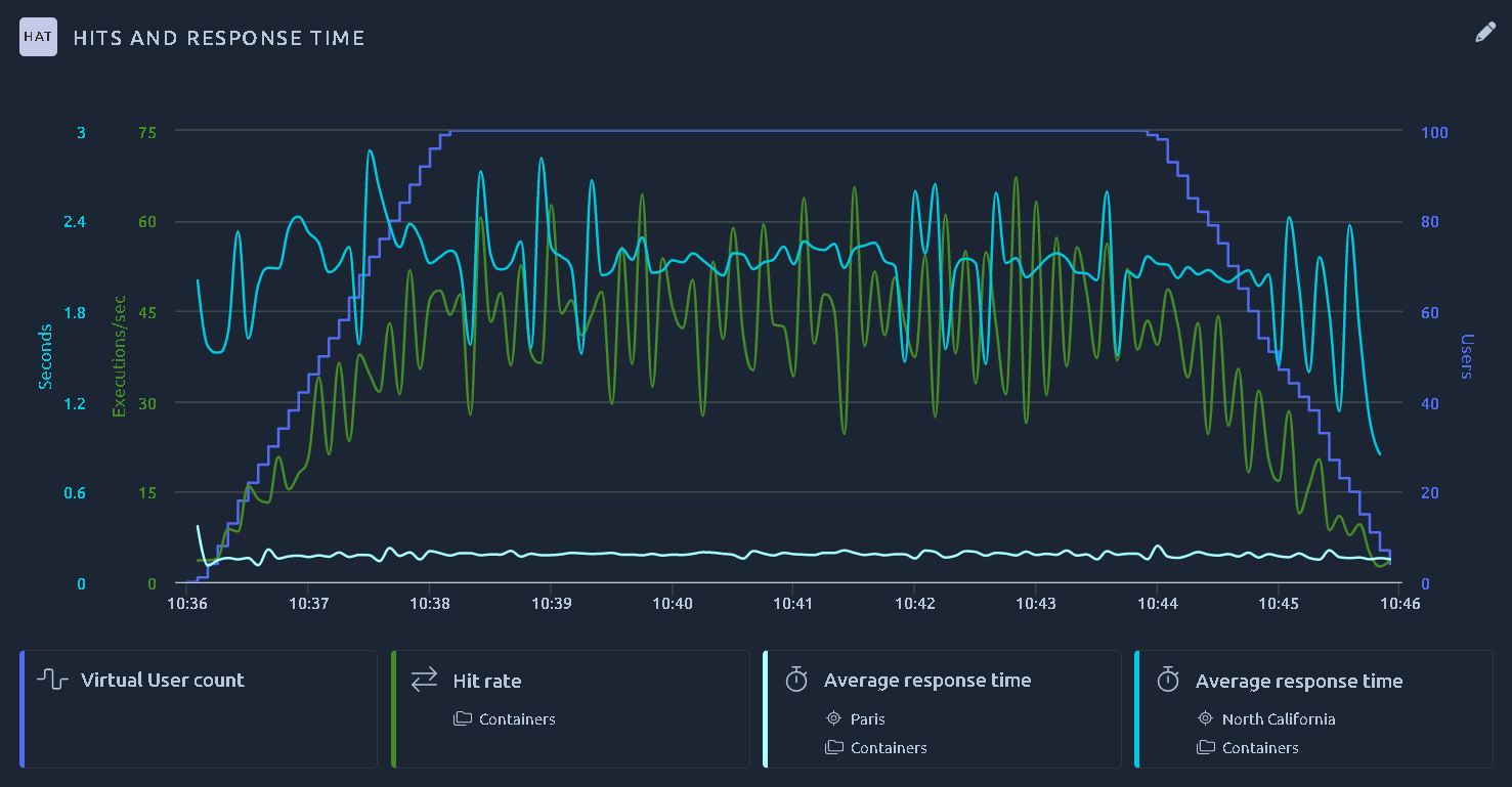
Several metrics are available, please report to the Hit Metrics Availability and Monitoring Metrics Availability tables.
Note
To customize a specific curve, please refer to the documentation page about the legend and metrics.
X axis
By default, a line chart shows its curves over time. The X axis box of the item Configuration panel lets you change that in two ways:
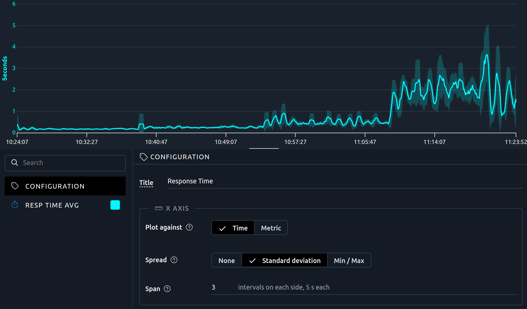
- Keep time, and add a band around each curve, to see how stable a metric is over the test: set a Spread.
- Plot the curves against another metric, to answer questions such as how does the response time grow with the number of virtual users?
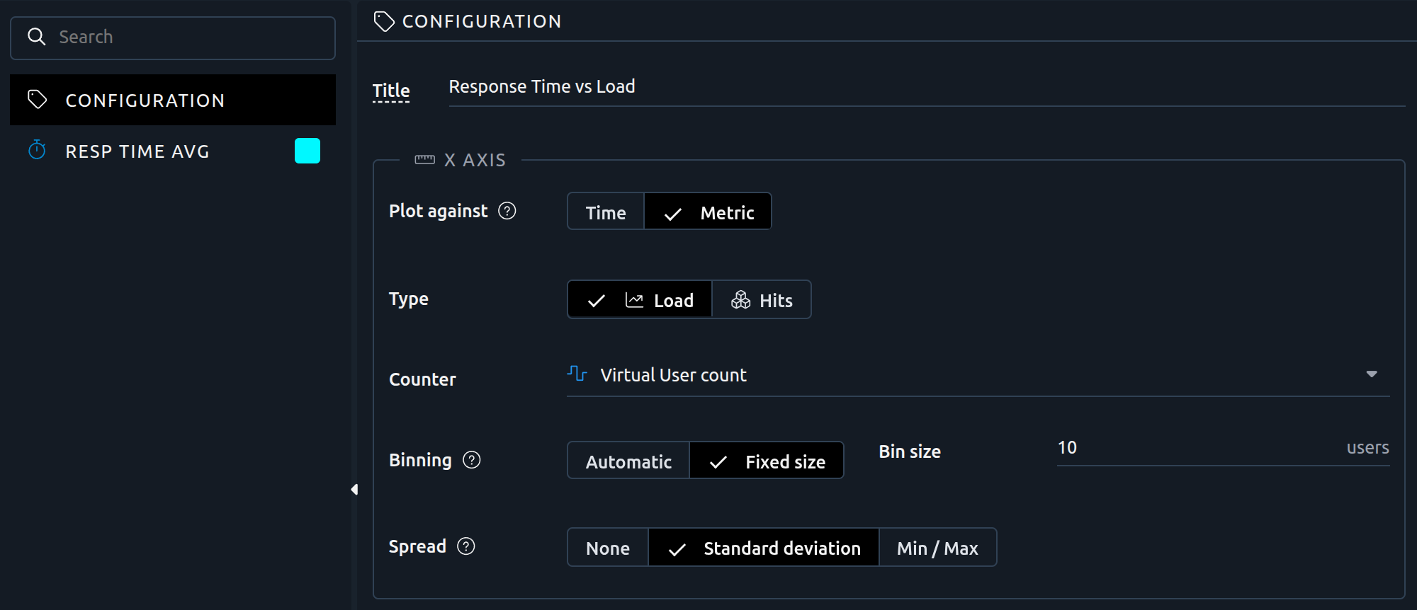
To plot against a metric, switch Plot against from Time (the default) to Metric, then pick the Type and the Counter of the X axis:
- A Load metric, for instance the number of active users,
- Or a Hits metric, for instance the hit rate, the throughput or the errors per second.
Each curve is then drawn against this metric, one point per range of X values. The X axis has no filters of its own: for each curve, it is measured with the filters of that curve (virtual user, location, action...).
Binning
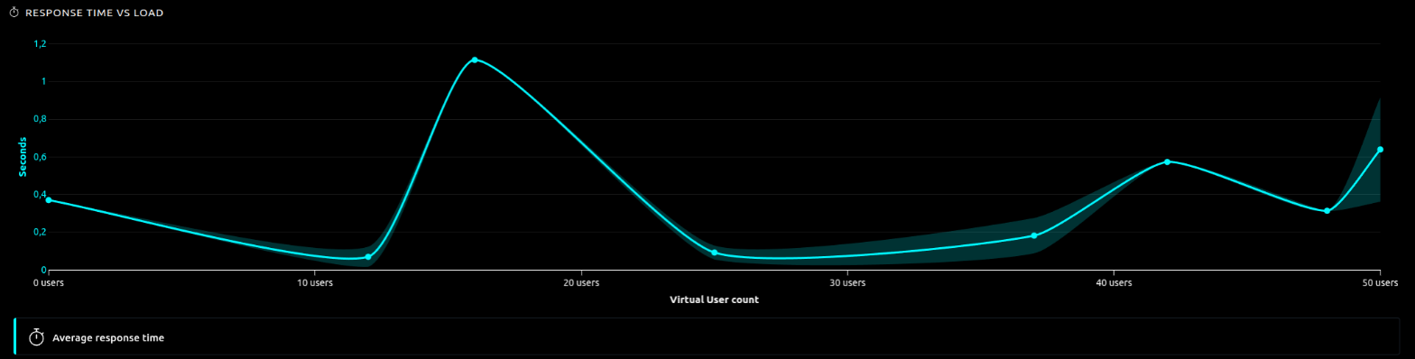
When you plot against a metric, the X values are split into ranges. Each point of a curve is the average of that curve over the sampling intervals of the test, a few seconds each, whose X value falls into the range:
- Automatic: OctoPerf chooses the ranges from the values measured,
- Fixed size: the ranges have the width you set in Bin size, starting from 0. The bin size must be greater than 0.
The bin size is in the unit of the X metric, shown next to the field: users for the load, milliseconds for the response time, the latency and the connect time, bytes for the sizes. A chart may show times in seconds, but the bin size of a time metric stays in milliseconds:
| X metric | Ranges you want | Bin size |
|---|---|---|
| Number of users | 0 to 10 users, 10 to 20 users... | 10 |
| Latency, around 1 second | 10 milliseconds wide | 10, not 0.01 |
Use a fixed size to get one point per load step, when your test increases the load by steps of a known size.
Spread
An average can hide how much a curve moves around it. Spread draws a band around each curve, whether the chart is plotted against time or against a metric:
- None: no band, the curves show their usual values,
- Standard deviation: from one standard deviation below the average to one above it. The band never goes below 0,
- Min / Max: from the lowest to the highest value.
What the band covers depends on Plot against:
- Against a metric: the values of the range, that is the sampling intervals whose X value falls into it.
- Against time: the values of the span around each point. Each point also becomes the average of its span: as long as a band is shown, each curve is a moving average. It is smoother than the raw curve, and a peak that lasts a single interval is flattened. To read the raw values, set Spread back to None.
Note
A line chart measures the test in sampling intervals of a few seconds, and draws one value per interval. The band is computed from these interval values, not from the individual requests: a single slow request only raises the average of its interval, so it does not widen the band by itself. To study the distribution of the response times themselves, use a Percentiles chart.
Span
On a chart plotted against time with a spread, Span sets how many sampling intervals each point takes on each side: at least 1, and 3 by default. Next to the field, OctoPerf shows the length of an interval when all the curves share the same one.
A span of 3 covers 7 intervals, the point's own interval and 3 on each side. With intervals of 5 seconds, each point and its band cover 35 seconds of the test. A larger span gives a smoother curve and a band over a longer period; a smaller span stays closer to the raw values.
Keep in mind that:
- At the start and the end of the test, or of the time range shown, a point has fewer intervals on one side, so its span is shorter.
- An interval without measurements is not replaced by another one further away: the span simply holds fewer values.
- During a ramp-up, the values of a span differ partly because the load changes. The band then shows that trend too, not only how unstable the metric is.
- In a comparison report, each curve counts its span in the intervals of its own test. The number of intervals is the same for every curve, but their durations may differ.
Rules
When you plot against a metric:
- The metric of the X axis cannot also be a curve of the chart: the curve editors no longer offer it once it is the X axis.
- A Hits X axis only accepts Hits curves. To plot HTTP, error, monitoring or custom metrics, use a Load X axis.
When a rule is broken, the X axis box explains which curve or metric to change.
What changes on the chart
Against a metric:
- Thresholds are still drawn as horizontal lines. Alarms are not shown, since they are located in time.
- The Y axes settings, logarithmic scale and dedicated axis, still apply to the curves.
- While the test is running, the whole chart is computed again at each refresh, as new measurements can change every range.
Against time with a spread, the X axis stays a time axis: thresholds and alarms are shown as on any line chart.
Tip
A typical use is a test that increases the load by steps: plot the average response time against the number of users, with a standard deviation band, to see at which load the response time starts to grow. The default report does it for you, with three charts plotted against the number of users:
- Response Time vs Load, with a standard deviation band,
- Hit Rate vs Load, the hit rate and the error rate,
- Connect Time / Latency / Response Time vs Load, in the SLA section.
A comparison report gets a Response Time vs Load chart too, with one curve per test. You can add Response Time vs Load to any report from the Line Charts group of the available items, and some insights open these charts.
Y axes
When the curves of a line chart have very different magnitudes, you can keep them readable in a single chart from the Y axes box of the item Configuration panel:
- Logarithmic scale: an axis can switch from linear to logarithmic, for all the curves it carries.
- Dedicated axis: a curve can be detached to an axis of its own, which fits the values of that curve.
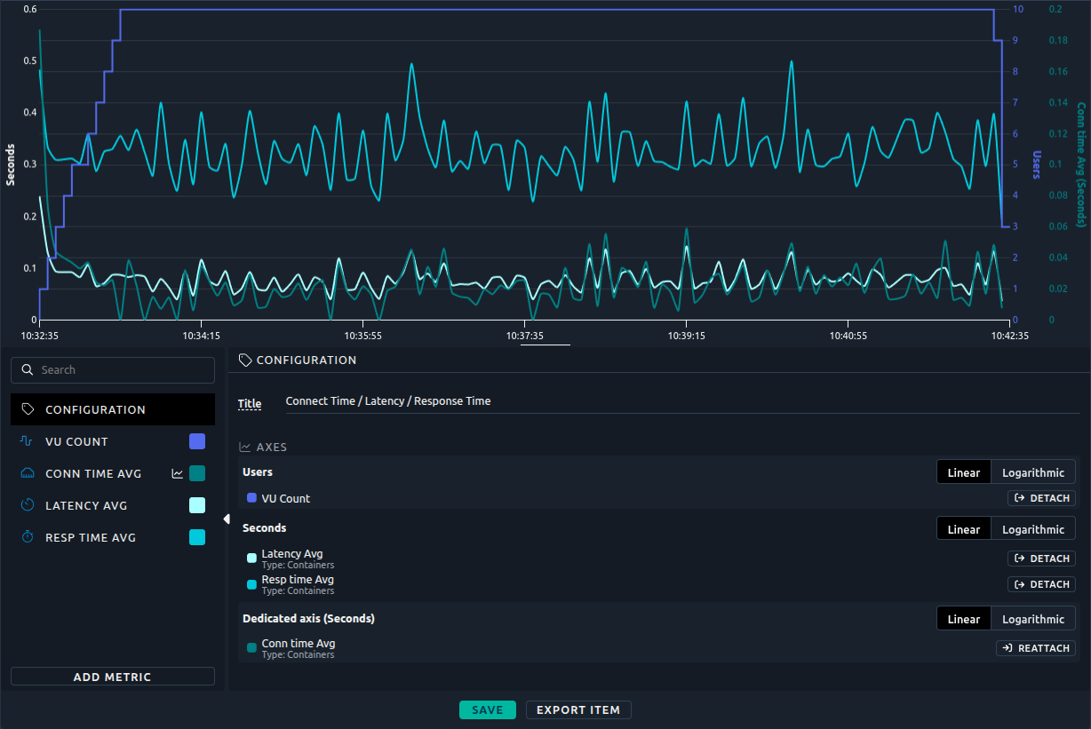
For example, to show the minimum, average and maximum response times together, detach the minimum response time or switch the Seconds axis to logarithmic.
This also applies to the line charts created from the monitoring. Refer to the Y axes documentation for details.
Zoom
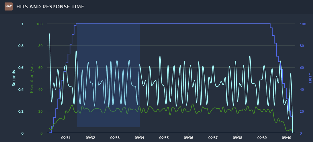
You can draw a rectangle anywhere in the graph to zoom on that section:
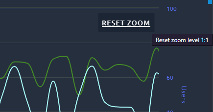
And later use the Reset zoom button to go back to full display:
Export
To export the chart please refer to the dedicated documentation page.